Get started
📱 Basic dashboard
Install the Vizro package to get started with dashboard creation.
Install Vizro with
pip install --upgrade vizro for the latest
features.
from vizro import Vizro
import vizro.models as vm

dashboard = vm.Dashboard(
    pages=[
        vm.Page(
            title="My first page!",
            components=[vm.Card(text="Welcome to Vizro!")],
        )
    ]
)

Vizro().build(dashboard).run()
Note:
This code creates a complete dashboard with pages & components,
and runs the application.
All other code in this cheatsheet are snippets to illustrate the
feature under discussion.
📄 Basic page
Define a single page with title, components, and layout configuration.
import vizro.plotly.express as px
import vizro.models as vm

df = px.data.iris()

# Basic page with components
page = vm.Page(
    title="My first page!",
    # Add your components here
    components=[
        vm.Graph(
            figure=px.scatter(
                df,
                x="sepal_length",
                y="petal_width",
                color="species",
            ),
        ),
    ],
    # Add your controls here
    controls=[vm.Filter(column="species")]
)
Page tips:
• Add tooltip with icon & meta tags by providing
• Define custom URL path by providing
description argument. • Define custom URL path by providing
path argument.
Components
Display interactive plotly charts and visualizations with data
filtering capabilities.
import vizro.plotly.express as px
import vizro.models as vm

df = px.data.iris()

graph = vm.Graph(
    figure=px.scatter(
        df,
        x="sepal_length",
        y="petal_width",
        color="species",
    )
)
Advanced data grid with enterprise features like grouping,
aggregation, and cell editing.
import vizro.plotly.express as px
import vizro.models as vm
from vizro.tables import dash_ag_grid

df = px.data.iris()

ag_grid = vm.AgGrid(
    title="Dash AG Grid",
    figure=dash_ag_grid(data_frame=df),
)
A KPI card displays a single value, with optional title, icon,
and reference. Vizro includes two built-in KPI card functions
kpi_card and kpi_card_reference.
import pandas as pd
from vizro.figures import kpi_card_reference
import vizro.models as vm

df_kpi = pd.DataFrame(
    {"Actual": [100, 200, 700], "Reference": [100, 300, 500]}
)

kpi_card_reference = kpi_card_reference(
        data_frame=df_kpi,
        value_column="Actual",
        reference_column="Reference",
        title="KPI reference (pos)",
)
Interactive button component that triggers actions and
callbacks when clicked.
import vizro.models as vm

button = vm.Button(
    text="Click me!",
)
Display text content, markdown, or HTML in a styled card
container.
import vizro.models as vm

    card = vm.Card(
        text="Hello World!",
    )
Group multiple components together with shared layout,
controls and styling options.
import vizro.models as vm

container = vm.Container(
    title="Analysis Section",
    components=[
        vm.Graph(figure=chart),
        vm.Card(text="Summary")
    ]
)

# Using Container within Tabs
tabs = vm.Tabs(
    tabs=[
        vm.Container(
                title="Overview",
                components=[vm.Card(text="Overview")],
        ),
        vm.Container(
                title="Details",
                components=[vm.Card(text="Details")],
        )
    ]
)
Display KPI cards or any custom figures.
import vizro.models as vm
from vizro.figures import kpi_card

figure = vm.Figure(
    figure=kpi_card(
        data_frame=df,
        value_column="column_name",
    ),
)
Render markdown text with support for formatting, links, and
embedded content.
import vizro.models as vm

text = vm.Text(
    text="Markdown text content",
)
Component tips:
• All components can be styled with custom CSS classes and IDs.
• All arguments of underlying dash components can be entered via
• All arguments of underlying dash components can be entered via
extra argument.
Controls
Apply data filtering to components based on column values using
various selector types.
import vizro.models as vm

filter = vm.Filter(
    column="species",
    selector=vm.Dropdown(
        value=["setosa", "versicolor"]
    ),
)
Filter tips:
• column argument denotes the target column to be filtered
• Set
• Set
targets to
specify which components on the page the filter should apply
to.
Dynamically control component properties through user input
selectors.
import vizro.models as vm

parameter = vm.Parameter(
        targets=["scatter_chart.title"],
        selector=vm.Dropdown(
           options=["My scatter chart", "A better title!", "Another title..."],
           multi=False,
        ),
    )
Parameter tips:
• Specify
• To make parameter optional you can specify the string "NONE" in the options or value field
• To change nested parameters, you can specify the
• selector argument is a mandatory field, specify it by providing the appropriate model and the desired options/numeric ranges.
targets in the form
target_component_id.target_argument
(for example,
scatter_chart.title) • To make parameter optional you can specify the string "NONE" in the options or value field
• To change nested parameters, you can specify the
targets argument with a dot
separated string like
target_component_id.target_argument.first_hierarchy• selector argument is a mandatory field, specify it by providing the appropriate model and the desired options/numeric ranges.
Interactive components for selecting from discrete categories
and options.
Dropdown
Click to view Dropdown API
selector=vm.Dropdown()
Checklist
Click to view Checklist API
selector=vm.Checklist()
RadioItems
Click to view RadioItems API
selector=vm.RadioItems()
Categorical selectors tips:
• When configuring
options use a dictionary with
label and
value
for custom labels.
Date and time selection components for temporal data filtering
and analysis.
DatePicker
Click to view DatePicker API
selector=vm.DatePicker()
DatePicker
Click to view DatePicker API
selector=vm.DatePicker(
range=False
)
Temporal selectors tips:
• When configuring the DatePicker make sure to provide your
dates for
min,
max and
value arguments in
"yyyy-mm-dd" format or as
datetime type (for example,
datetime.datetime(2024, 01, 01)).
Components for selecting numerical values and ranges with
precise control.
Slider
Click to view Slider API
selector=vm.Slider()
RangeSlider
Click to view RangeSlider API
selector=vm.RangeSlider()
Component for selecting boolean values.
Switch
Click to view Switch API
selector=vm.Switch(
title="Is True?",
)
Page layout & navigation
Multi-page dashboard
Create dashboards with multiple pages and automatic navigation
between them.
import vizro.models as vm

page_1 = vm.Page(
    title="Overview",
    components=[
        vm.Card(text="Test")
    ]
)

page_2 = vm.Page(
    title="Details",
    components=[
        vm.Card(text="Test")
    ]
)

page_3 = vm.Page(
    title="Summary",
    components=[
        vm.Text(text="Test")
    ]
)

dashboard = vm.Dashboard(title="My dashboard",pages=[page_1, page_2, page_3])
Navigation
Click to view Navigation API
Configure custom navigation to group pages together and
customize how they appear in your navigation by specifying a
navigation model.
import vizro.models as vm

navigation = vm.Navigation(
    pages=[page_1, page_2, page_3],
    nav_selector=vm.NavBar(
        items=[
            vm.NavLink(
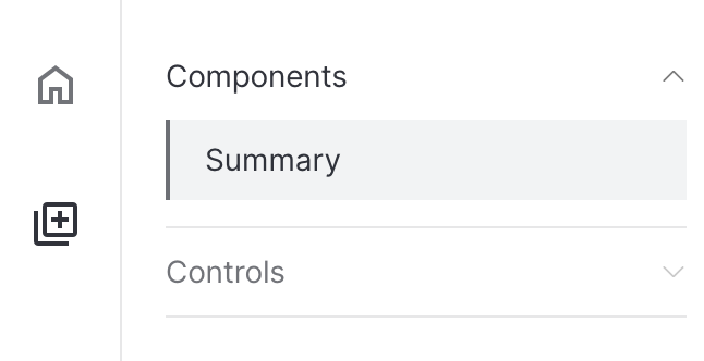
                icon="home",
                label="Home",
                pages=["Overview"],
            ),
            vm.NavLink(
                icon="Library Add",
                label="Features",
                pages={
                    "Components": ["Text"],
                    "Controls": ["Details"]
                },
            ),
        ]
    )
)
Grid layout
Click to view Grid API
Arrange components in grid patterns with precise positioning and
responsive design with grid layout.
import vizro.models as vm

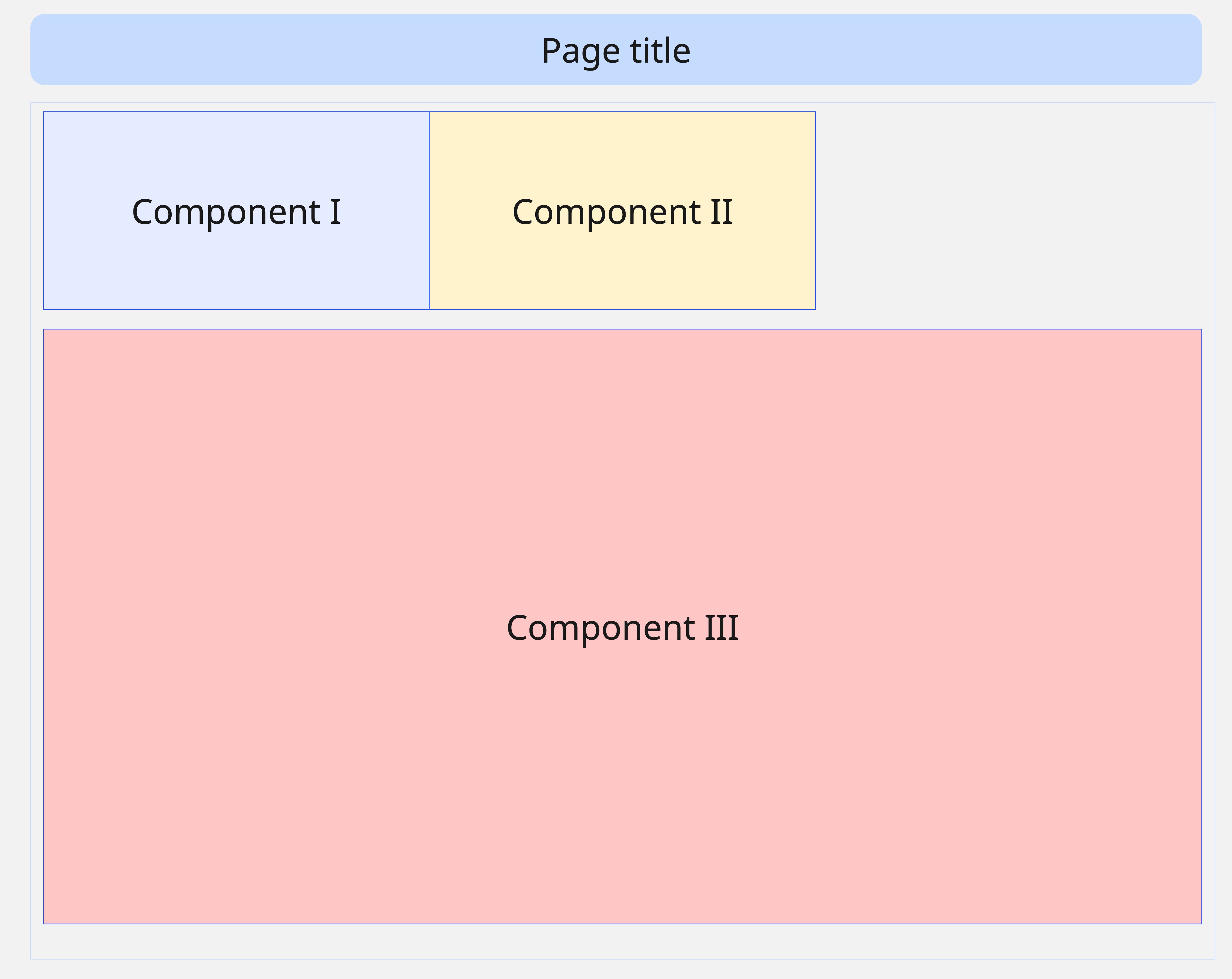
grid_layout = vm.Grid(
    grid=[
        [0, 1, -1],
        [2, 2, 2],
        [2, 2, 2],
        [2, 2, 2],
    ],
)

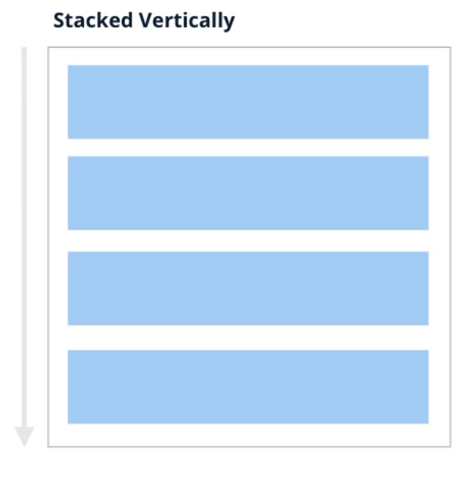
grid = [[0], [1], [2], [3]

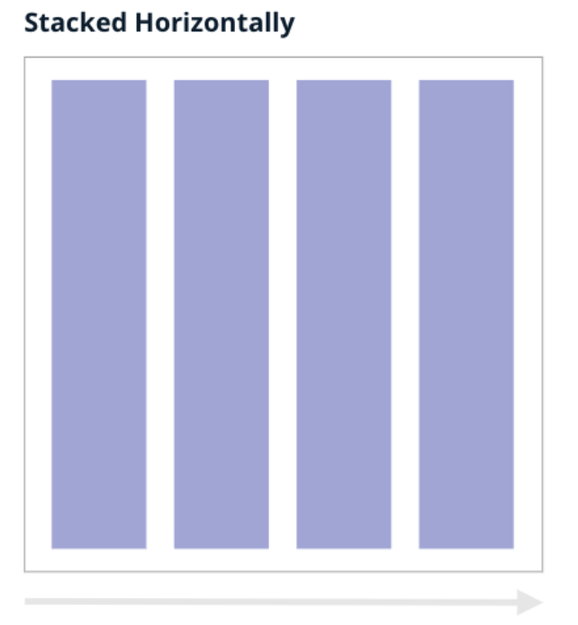
grid = [[0, 1, 2, 3]]

Grid layout tips:
• Grid numbers match component positions
• Add empty spaces within grid layout by specifying -1 e.g
• Control the scroll behavior by specifying
• Add empty spaces within grid layout by specifying -1 e.g
grid=[[0], [1], [-1]] • Control the scroll behavior by specifying
row_min_height and
col_min_width
Flex layout
Click to view Flex API
Achieve flexible layout system for dynamic component arrangement
and responsive behavior with flex layout.
import vizro.models as vm

flex_layout = vm.Flex(
    direction="row",
)
Flex layout tips:
• To wrap components into multiple lines use
• Control the spacing between components in the flex container by using
wrap=True • Control the spacing between components in the flex container by using
gap argument
Data management
Apply the data_frame directly to your chart if your data will
not refresh while the dashboard is running.
import pandas as pd

# Load data
df = pd.read_csv("data.csv")

# Use in components
vm.Graph(
    figure=px.scatter(
        data_frame=df,
        x="x_col",
        y="y_col"
    )
)
Static data tips:
• The same can be achieved by assigning the
data_frame to the data_manager key such as
data_manager["my_data"] = df, and then
referencing it in the figure like:
data_frame argument in your figure, like:
figure(data_frame="my_data")
A dynamic data source is a Python function that returns a pandas
DataFrame. Use if you need your data to be refreshed without
restarting the dashboard.
import pandas as pd
from vizro.managers import data_manager

# Load data
def load_iris_data():
    iris = pd.read_csv("iris.csv")
    return iris.sample(50)

data_manager["iris"] = load_iris_data

# Use in components
vm.Graph(
    figure=px.box(
        data_frame="iris",
        x="species",
        y="petal_width",
        color="species",
    )
)
Dynamic data tips:
• Enable
caching
to avoid performance issues with frequent reloads.
Add arguments to your dynamic data loading function and control
it from the dashboard.
import pandas as pd
from vizro.managers import data_manager

# Load data
def load_iris_data(number_of_points=10):
    iris = pd.read_csv("iris.csv")
    return iris.sample(number_of_points)

data_manager["iris"] = load_iris_data

# Use in components
vm.Graph(
    figure=px.box(
        id="graph",
        data_frame="iris",
        x="species",
        y="petal_width",
        color="species",
    )
)

parameter =  vm.Parameter(
    targets=["graph.data_frame.number_of_points"],
    selector=vm.Slider(min=10, max=100, step=10, value=10),
)
Parametrized dynamic data tips:
• Always return a DataFrame with a fixed schema when using
parameters.
• Add function arguments with default values to make data sources configurable from the dashboard.
• Use parameters to filter or reduce large datasets before they reach the dashboard for better performance.
• Add function arguments with default values to make data sources configurable from the dashboard.
• Use parameters to filter or reduce large datasets before they reach the dashboard for better performance.
Actions
Export data
Click to view export_data API
To enable downloading data, you can add the export_data action
function to the Button component.
import vizro.models as vm
import vizro.actions as va

# Use action in a Button component
vm.Button(
     text="Export Data",
     actions=va.export_data()
)
Cross-filter from Table
Click to view set_control API
Click on a table row to filter a graph by that row’s value.
import vizro.models as vm
import vizro.plotly.express as px
import vizro.actions as va
from vizro.tables import dash_ag_grid

df = px.data.iris()

page = vm.Page(
    components=[
        vm.AgGrid(
            figure=dash_ag_grid(df),
            actions=va.set_control(control="filter_id", value="species"),
        ),
        vm.Graph(id="graph_id", figure=px.histogram(df, x="sepal_length")),
    ],
    controls=[
        vm.Filter(id="filter_id", column="species", targets=["graph_id"])
    ],
)
Tip:
• The same can be achieved if the graph is
the source of the set_control action. In that
case, include
custom_data in
the graph’s figure so the clicked value can be passed to the
filter. For example:
vm.Graph(df,
    figure=(..., custom_data=["species"]),
    actions=va.set_control(... value="species"),
)
Actions tips:
• Chain multiple actions together by providing them in sequence
you want them to be executed. Next action in order will execute
only after the previous action has completed.
Custom components
Custom tables
Build custom data tables with specific formatting, styling, and
interactive features.
import vizro.models as vm
from dash_ag_grid import AgGrid
from vizro.models.types import capture


df = px.data.gapminder()

@capture("ag_grid")
def my_custom_aggrid(chosen_columns: list[str], data_frame=None):
    defaults = {
        "className": "ag-theme-quartz-dark ag-theme-vizro",
        "defaultColDef": {
            "resizable": True,
            "sortable": True,
            "flex": 1,
            "minWidth": 70,
        },
        "style": {"height": "100%"},
    }
    return AgGrid(
        columnDefs=[{"field": col} for col in chosen_columns],
        rowData=data_frame.to_dict("records"),
        **defaults,
    )

# Use in AgGrid component
vm.AgGrid(
    figure=custom_table(
        data_frame=df,
        chosen_columns=["country", "continent", "lifeExp", "pop", "gdpPercap"]
    )
)Custom figure
Design custom KPI cards or other figures with complex layouts
and specialized visualizations.
import vizro.models as vm
from vizro.models.types import capture
import pandas as pd
import dash_bootstrap_components as dbc
from dash import dcc, html

df = pd.DataFrame({"text": text * 2})

@capture("figure")
def multiple_cards(
        data_frame: pd.DataFrame, n_rows: int = 1
) -> html.Div:
    texts = data_frame.head(n_rows)["text"]
    return html.Div(
        children=[
            dbc.Card(dcc.Markdown(f"### Card #{i}\n{text}"))
            for i, text
            in enumerate(texts, 1)
        ],
        className="multiple-cards-container",
    )

# Use in Figure component
vm.Figure(
    id="my-figure",
    figure=multiple_cards(data_frame=df)
)Custom components
Extend any Vizro component or create completely new ones using
any dash-compatible component.
from typing import Literal
from dash import html
import vizro.models as vm

class Jumbotron(vm.VizroBaseModel):
    type: Literal["jumbotron"] = "jumbotron"
    title: str
    subtitle: str
    text: str

    def build(self):
        return html.Div(
            [
                html.H2(self.title),
                html.H3(self.subtitle),
                html.P(self.text),
            ]
        )

# Register the component
vm.Page.add_type("components", Jumbotron)Custom charts
Create custom plotly charts with advanced styling and
interactive features beyond standard templates.
import vizro.models as vm
from vizro.models.types import capture
import vizro.plotly.express as px

df = px.data.iris()

@capture("graph")
def scatter_with_line(data_frame, x, y, color=None, size=None, hline=None):
    fig = px.scatter(
        data_frame=data_frame,
        x=x,
        y=y,
        color=color,
        size=size,
    )
    fig.add_hline(y=hline, line_color="gray")
    return fig

# Use in Graph component
vm.Graph(figure=custom_chart(data_frame=df))Custom actions
Implement custom callback functions that respond to user
interactions and update dashboard state.
import vizro.models as vm<
from vizro.models.types import capture

@capture("action")
def update_card_text(my_dropdown_value):
    return f"You selected species **{my_dropdown_value}**"

# Use with Action
vm.Button(
     text="Export Data",
     actions=vm.Action(
         function=update_card_text("my_dropdown"),
         outputs=["my_card"],
     ),
)Custom styling
Add custom css for your dashboard.
/* Apply styling to parent */
.card:has(#custom-card) {
    background-color: white;
}

/* Apply styling to child */
#custom-card p {
    color: black;
}vm.Card(
id="custom-card",
text="Lorem ipsum."
)
Custom styling tips:
• Use model ID for core, and suffixed IDs like
• Many Vizro models accept an
{model-id}-title
for non-core parts. Both can be targeted with the CSS #id
selector.
• Many Vizro models accept an
extra argument for the
underlying Dash component. Use it to pass options like
style or
className to adjust
styling.